Recently Seth Godin reminded us Don’t forget about color. He’s right. Subtle use of color, whether to make airports signs easier to follow or to make your blog more memorable, is a great idea.
A Dumb Little Man can’t be wrong. When I am skimming posts in my RSS feed I can always identify a Dumb Little Man post by the bright orange headlines. Subtle use of color works wonders for brand recognition. I’m not saying bright orange is a subtle color, but in Dumb Little Man’s case working it into each and every post has resulted in me being able to easily identifying a post as belonging to his blog.

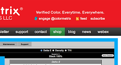
Green is a good color. Well it is for the ColorMetrix.com e-commerce shopping experience anyway. Starting with the shop menu option, we have made subtle use of color, as each action point in the shopping process is color coded green. The idea being, that by a couple clicks into the process, the user is looking for green.

Title and headline contrast. I’ve made use of bold fonts on this blog for a while. Mr. Godin got me thinking about the success of Green over on ColorMetrix.com and the strong memory of Orange on Dumb Little Man. Over the last week or so I have been toying with the title and headline colors here.
Have you noticed the subtle use of color in the headlines? What do you think of colored titles and headlines here and on other blogs?