The WordPress Dashboard is possibly one of the most powerful, yet misunderstood tools on the entire internet. I say this because left to its own devices the dashboard will become a disorganized mess of widgets installed by your chosen theme and various plugins. I wonder if you even know you can select which widgets are displayed? Or that the ones you choose to display can be rearranged by dragging and dropping them? If you answered “no” to those two questions, then this post is for you.
Step 1: Decide what to display
Located in the upper right corner of your Dashboard page is a pull-down tab titled “Screen Options.” When you click on that tab you’ll be presented with a checkbox list of all the widgets currently available to be displayed on your Dashboard. In most cases, when you have not done any configuration of your dashboard, all the modules will be checked. That can make for one messy dashboard depending upon your theme and installed plugins.
To get a feel for how clean and useful your WordPress dashboard can be, give this a try: Uncheck all the boxes. Now, check them one at a time and see what each widget does for your WordPress experience. Is the information provided by the widget useful and helpful for the way you go about managing your site? If not, uncheck it and move on to the next module.
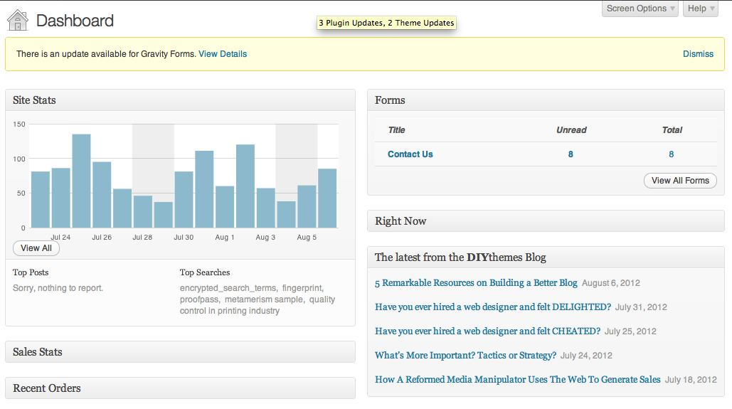
In the case of our ColorMetrix website (shown in the image above), I’ve settled on six Dashboard widgets that add value to the experience. When I log in, I can see how things are going from a business standpoint.
Step 2: Decide what’s most important
Now that you have figured out which widgets matter to you, it’s time to organize them in a way that makes sense to you. As a general rule, I put the most important widgets at the top of each column. You position the widgets by clicking on the title bar. Then you can drag and drop each widget where you want it displayed within the dashboard layout.
The goals of your site will change from time to time. As the goals change, it’s a good idea to move the widgets around to provide quick access to the information that will help you assess your achievement of the new goals. Sometimes I just move the widgets around so I see them again. Our brains get very good at ignoring and filtering out information that seems repetitive and unnecessary. By moving the widgets around, you can fool your brain into noticing the information again.
Step 3: Minimize what you can
When you hover your mouse over the title bar of a widget, an arrow will appear on the far right. The arrow can be used to maximize or minimize the widget depending upon its current state. This can be useful for several reasons. In the first image with this post, I was able to minimize the e-commerce plugins to keep information private but let you see what the rest of the dashboard looks like. Also by minimizing many of the widgets, I was able to fit them all on the screen at one time for the screen capture above.
And now it’s your turn. Do you have any WordPress Dashboard tips to share? Leave a comment and let us all know.

