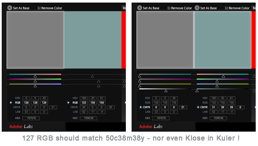
Michael Jahn, a JimRaffel.com reader replied to me via email about a previous post and I found his comments enlightening about how scary the world of color has become for those of us in the graphic arts that have to actually print this stuff.
So, for the first time ever (I think) a guest contributor at JimRaffel.com….
Hi Jim,
Read you blog about Kuler;
As I suggest in my subject like, I do not think Kuler is cooler.
Okay, I will give you it has a sweet looking thing to look at, but so was that Brazilian chick I dated.
example – go to Kuler – in the search tool, enter “swop”
See attached (this is made from several screen captures – Kuler runs in a browser, so that is RGB – I did my screen captures in Photoshop building while in CMYK, profile was SWOP version 2 – not wanting to debate the fine points, as Kuler seems to have no real notion of CMYK that one wonders why they offer it at all…
So, my gripe is that if one were specifying in CMYK
— 50k should look fairly close to 50c, 38m, 38 y, 0k – in Kuler (TOP) they don’t, and in Photoshop, (BOTTOM) they do
and 50c, 50m, 50y 0k should look a bit warmish brownish, in Kuler it is neutral (incorrect) and in Photoshop it is a bit warmish brownish (correct)
I have no explanation as to why 19c, 0m, 0y, 38k should look like 50c, 38m, 38 y, 0k – in Kuler, or anything that might create, display, report proof, print or plate.
Clearly – This is not ready for prime time for color specifying in the world of print
—
Michael Jahn
Jahn & Associates
PDF Color Conversion Specialist
