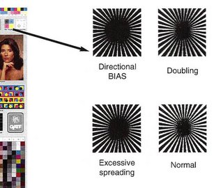
This week as part of a larger conversation a potential client asked, “What should my color bar look like?” My first thought was that it would be easier to answer the following question…”What is the meaning of life?” The answer to the color bar question can be both simple and complex, at the same time. We should begin with why this potential client was asking the question. The company involved is a very large consumer products concern. As such they are the ultimate consumer of the print (i.e. – they pay for it). Others in the supply chain are pushing for a fairly large color bar to be included on each package. While in principle I agree with measuring as much as you can, I have also assisted customers with almost not space for a color bar and found a way to measure enough to be meaningful.
The interesting trend I see in consumer product printing (i.e. – packaging) is towards more informative color bars. While in the past getting designers to allow even solid blocks of the process and spot colors was like pulling teeth, now you see targets approaching the size of the ECI target (sarcasm). I believe the reason for this is simple. Managing libraries of dozens, hundred, or even thousands of spot colors can be almost impossible. If, however, one moves towards some form of 6 or 7 color process printing some pretty amazing economies of scale begin to occur.
The trick is that if you are producing a critical spot color with some build of process inks those inks and all associated print attributes need to be “spot on.” The only way I know to control critical press factors like density, dot gain, print contract, etc… is to measure as many color bar patches as possible. See how simple the answer to these complex questions can be?
So, ranked in order of importance (Jim Raffel’s order) here are the patches I would want to see on a press color bar. (We can talk about proof control bars in another Golden Nugget)
- Unprinted substrate patch (to zero out substrate when necessary)
- Solid patch for each process (and spot) color (needed for solid ink density (SID))
- 3/Color Grey patches at multiple tone values (if you are not sure why please re-read all your Golden Nuggets before proceeding)
- Mid-tone patch for each process color (only way I know to gather dot gain (TVI) values)
- Process color over prints (needed to measure trapping efficiency of inks, this gets a bit tricky in 6 and 7 color printing)
- Additional highlight and shadow tone patches of each process color (i.e. – we need a 75% patch to calculate print contrast)
- GATF Star targets or microline targets (used to visually evaluate for press slur and doubling issues)
All of the 7 items listed above are important and truly necessary but if space is an issue start with number 7 and work backwards removing items until the bar fits. Also, items 3 and 4 could be easily reversed; having one without the other makes diagnosis of grey balance issues difficult at best. Now, for my radical comment of the week….if you do not have room for items 1-3 and quality print is important to you…redesign the piece.


[…] was first published on JimRaffel.com on Nov. 3, 2005. It has been re-purposed for […]